Whenever I head to Palm Springs, The Viceroy is the place I always have to visit.
Originally opened in 1933 as a boutique hotel, the property was completely redesigned in 2001 by the Grande Dame of Design herself, Kelly Wearstler. (Her husband is the CEO of the Viceroy Hotel Group) The hotel consists of 67 guest rooms, including studios, suites and private villas. All rooms and bungalows feature a classic Hollywood regency style using black and white with punches of neon yellow.
The lobby
A bungalow
The entrance to their beautiful spa, Estelle.
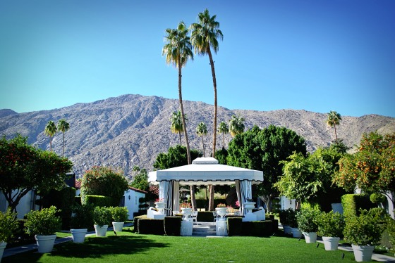
Outdoor massages under the gazebo!
The property has three large pools. This one is viewable from the hotel rooms. Look at that yellow and white awning stripe fabric, how Troop Beverly Hills.
“Never go to Reno for a divorce, girls. The California community property laws cannot be beat.”
God, I love that movie.
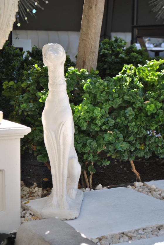
Oh, hello there Monsieur.
These white greyhound statues are the signature item of the hotel. They’re everywhere.
This is the entrance to their meeting space. Yes, that is astro turf. I may or may not have got down on all fours to sniff it and make sure.
The interior is decorated with cool gray walls, wainscoting, (love that mirror inset idea) white chiavari chairs, and chrome accents.
A closer look at one of the glass chandeliers. I’m pretty sure that plaster sunburst detailing is original to the building.
Had to get a quick shot of the roman shades on the doors. I love a hint of greek key.
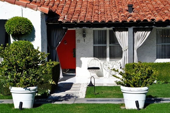
The entrance to a bungalow. Please ignore the sunspot. Bad photographer! Bad! Instead note the coral doors (GOD, I love that color) the chrome hardware, and the striped awnings.
The view when you step inside. While we’re on the topic of things I love, here’s another, a good kick plate. They transform any door.
The ample living room
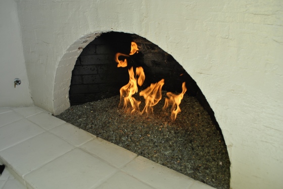
A closer look at the glass fireplace. I adore this style of gas fireplace. You simply turn that knob on the left wall, and then hold a match over the glass shards, and it instantly lights. Much more aesthetically pleasing than those faux log monstrosities.
I find it so cool that they selected such a vibrant wallpaper and continued it through to the ceiling. It defines the space and creates a comforting feeling. Definitely a pro’s trick you can steal for your home.
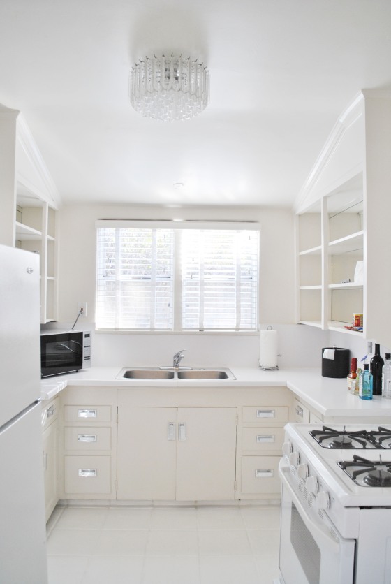
The kitchenette was the only let down for me. It looks like something you’d find in a Queens fourth floor walk-up. I understand wanting to maintain the integrity of the original 1933 space… but new counters, a modern sink, and appliances would have gone a looong way.
The bathroom. Another decorator trick you can adapt for home. If you have a standard tub/shower combo, give it drama by raising up the curtain bar ( you can go all the way to the ceiling) and using two curtains with tie backs. Then use a fabric shower liner. Always a FABRIC liner. There is nothing tackier than a plastic shower curtain. I’d rather watch you eat Colby cheese on a chicken in a biscuit cracker than see a plastic shower curtain in your home. Seriously.
Here’s something I don’t find tacky. A neatly stocked lucite shower caddy.
Now for the pièce de résistance, a dramatic bedroom.
Floor to ceiling drapes, an almost all white palate, greek key, and a stylish armoire…Swoon.
Also, swoon-worthy was their restaurant Citrone.
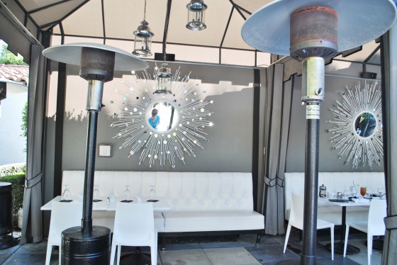
They have a mix of indoor and outdoor dining spaces.
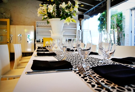
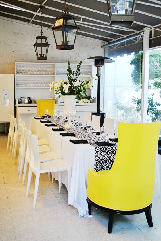
A table all set up for something fabulous. How fun would it be to have a bridal shower here? Or a bachelorette weekend:)
A view into the delightful bar
So bright and chic. It reminds me of something that would be on the Cote de Azure.
I’ll close this post with another gratuitous pool shot.
Hope you enjoyed this addition of Hotel Crashing! Tomorrow, I’ll be dissecting the newest edition of Elle Decor. There are some hits and some BIG misses… Also, I’ll have a look at the new Lily Pulitzer furniture line and a DIY Union Jack dresser. Here’s a teaser…
Stay tuned!

